Il Bagolaro
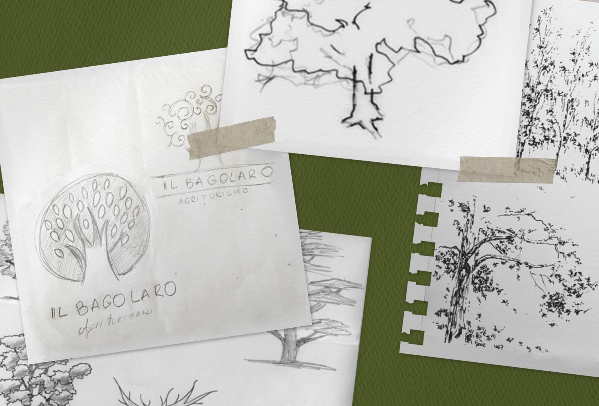
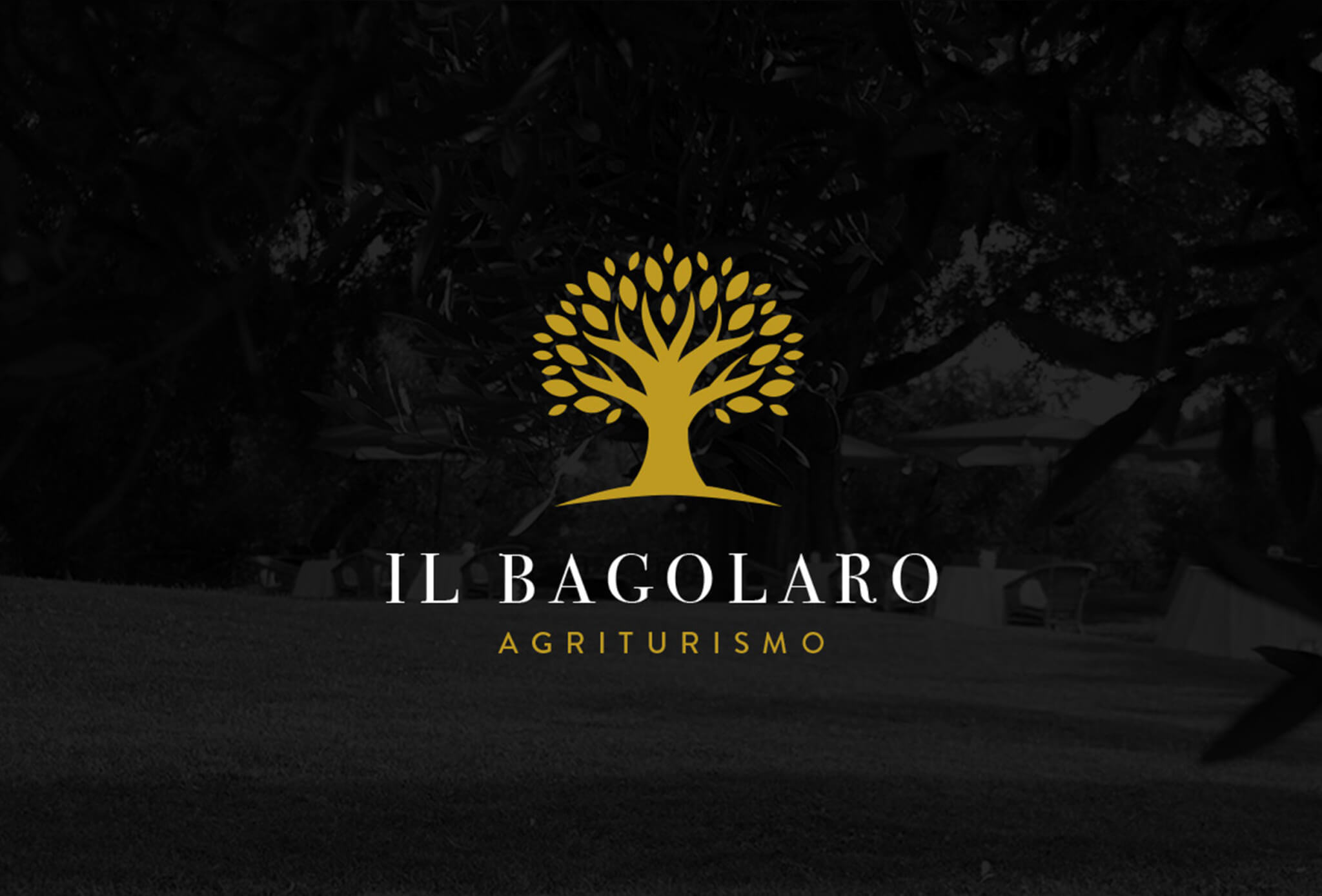
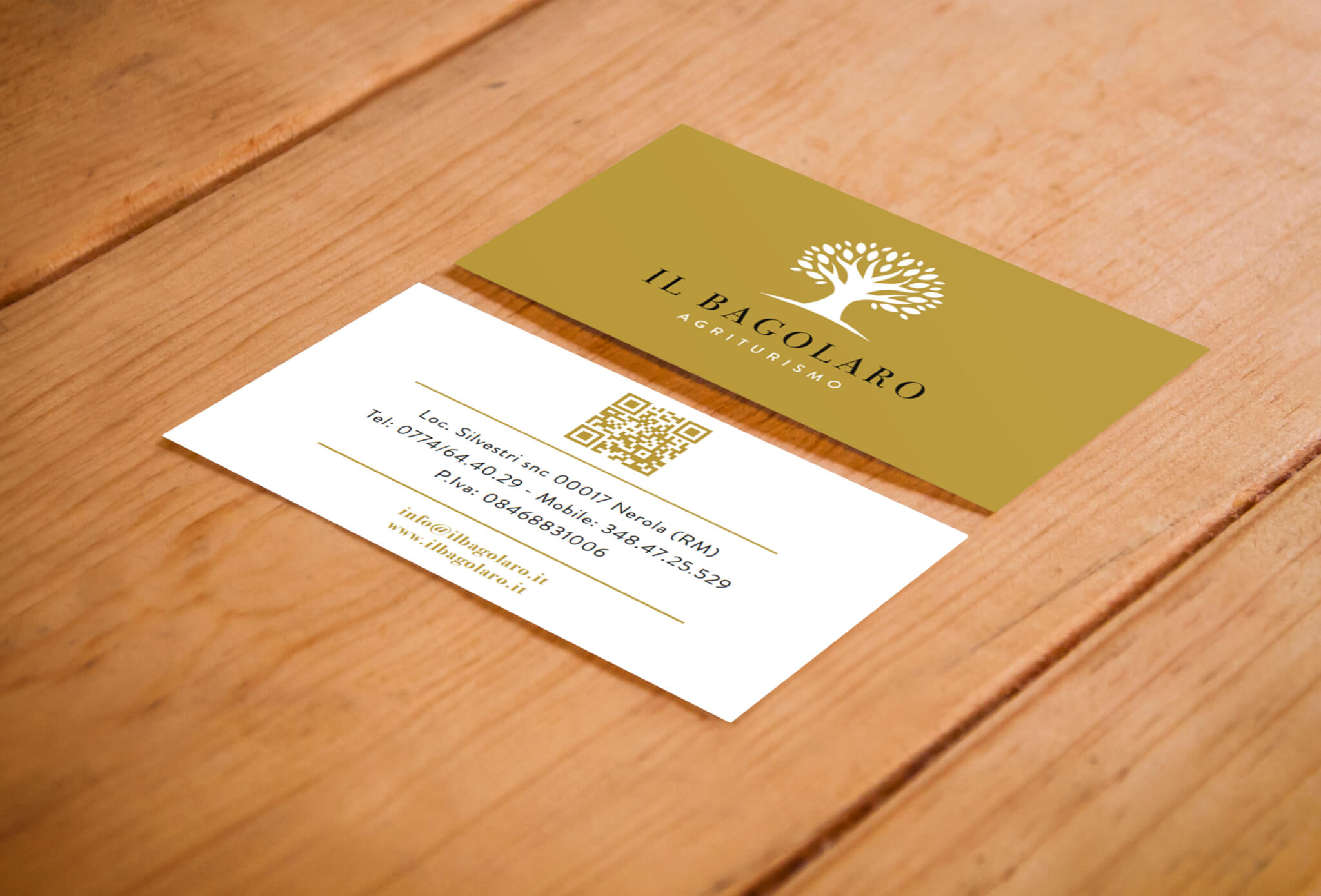
Il Balogaro required a new identity capable of communicating not only its tradition, but even its values of elegance, sophistication, and exclusivity. The project entrusted to Purobianco implied a total restyling of the brand identity starting from a new logo and a coordinated image, to the development of the new SEO optimized website. The concept sees the Mediterranean Hackberry (Bagolaro) as the protagonist – a robust, solid and sturdy tree – juxtaposed to a light font reminding to imperial style thanks to its golden hues. This project roots in the past but looking ahead thanks to its minimal and elegant sign and a fresh and modern communication line
Client: Il Bagolaro
Tag: Branding, Graphic Design, Packaging, UX/UI Design

Packaging
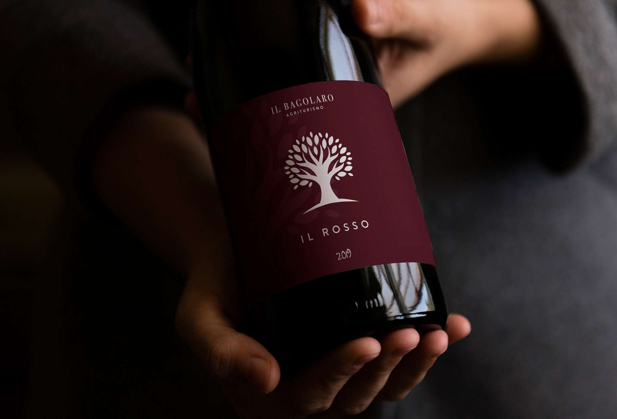
The development of the packaging visual identity was a fundamental part of this project. The packaging keeps evolving thanks to brand new products and limited editions. In line with the new visual identity, the agency gave a new face to Il Bagolaro’s 0 km products – overall, sweet and savory spreads and Sabina DPO Olive Oil. The chromatic identity is strong: in contrast with the golden logo, black is the leading color conveying elegance and sophistication.


