MedLav
MedLav is a new brand on the Occupational Health national scene. Thanks to the experience gained in the field, MedLav is a solid and trustworthy innovative company. Its new identity and 360-degree communication strategy fully involve Purobianco in a total branding project in line with the MedLav mission: from naming to brand identity up to a landing page.
Client: MedLav
Tag: Branding, Graphic Design, UX/UI Design

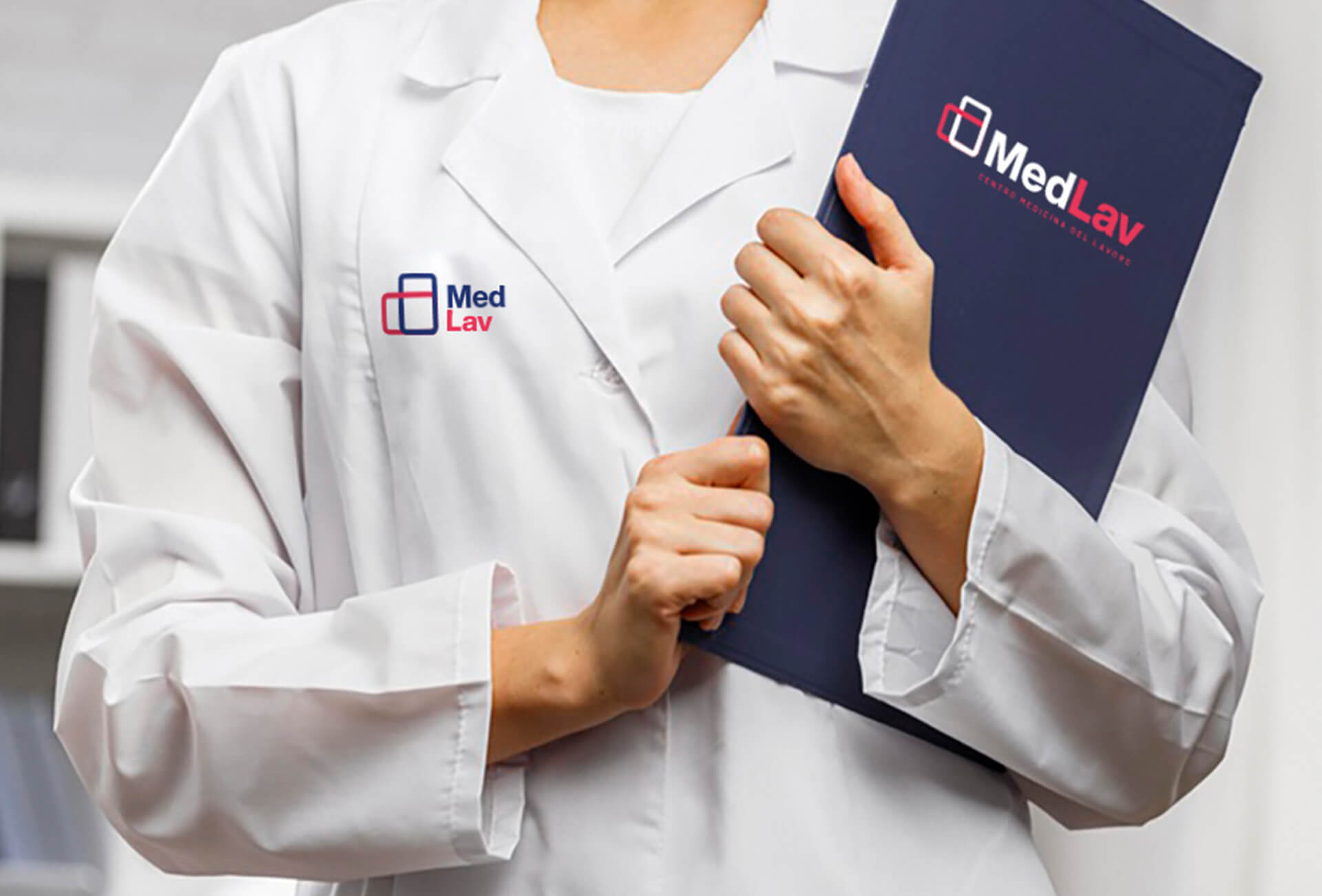
Logo & Brand Identity
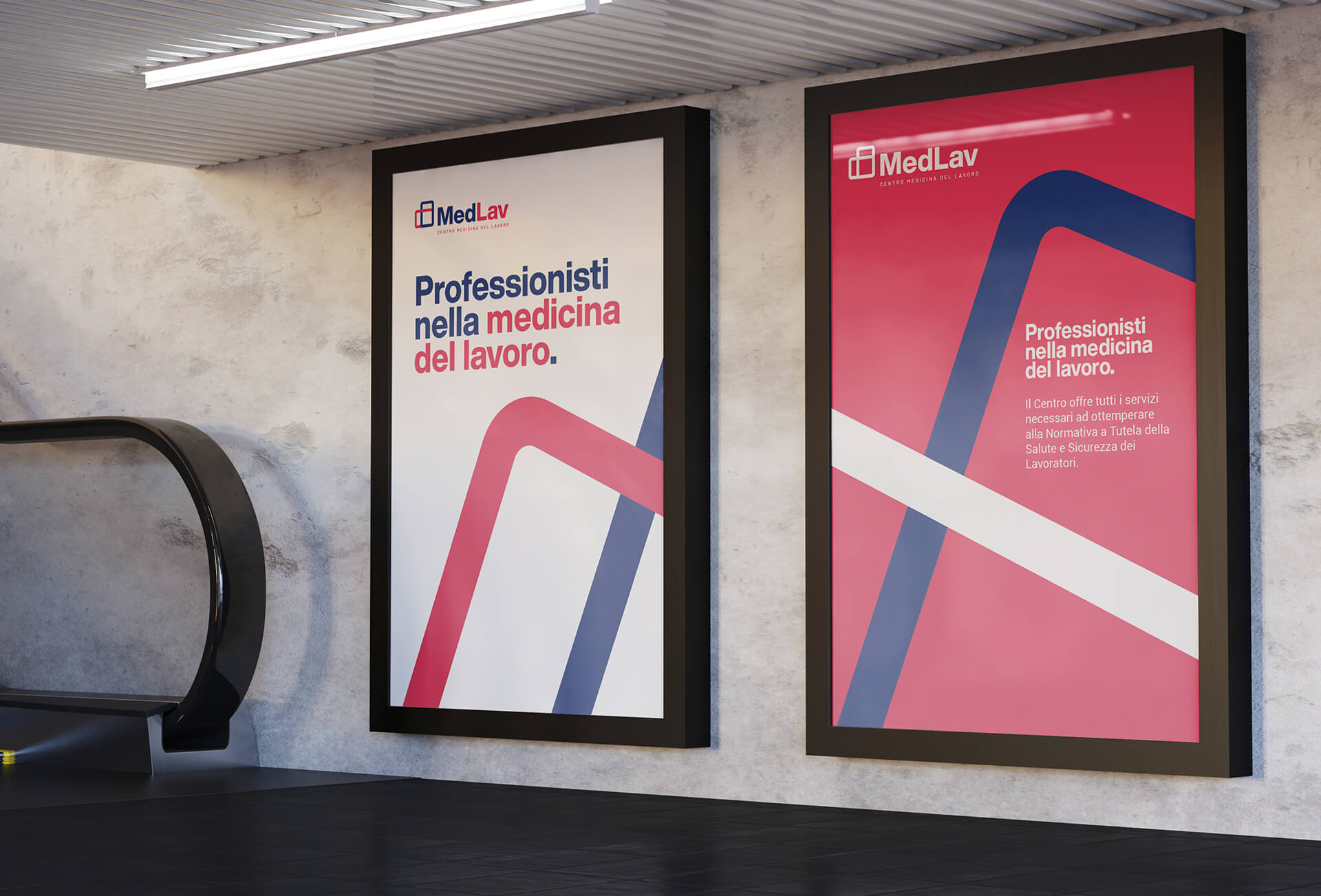
The project concept stems from a visual study of the Star of Life symbol – the icon of the field – reviewed in a modern and dynamic perspective able to convey the idea of protection, safety, and dynamism. The brand is made of a pictogram representing a portion (half) of the Star of Life and a logotype in bold sans serif font. The key concept is the image of intertwining at the foundation of those ideas of connection, unity and collaboration amongst the various professional roles
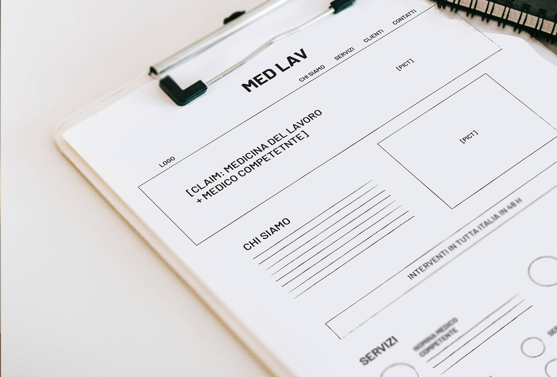
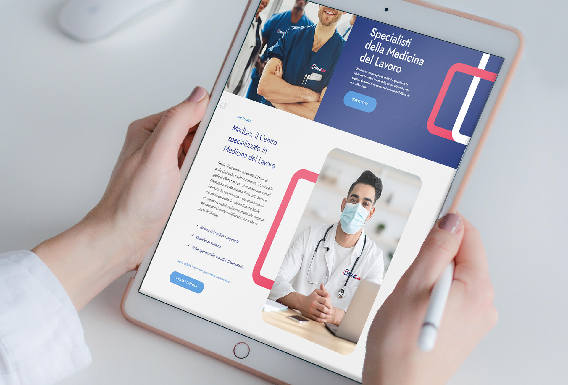
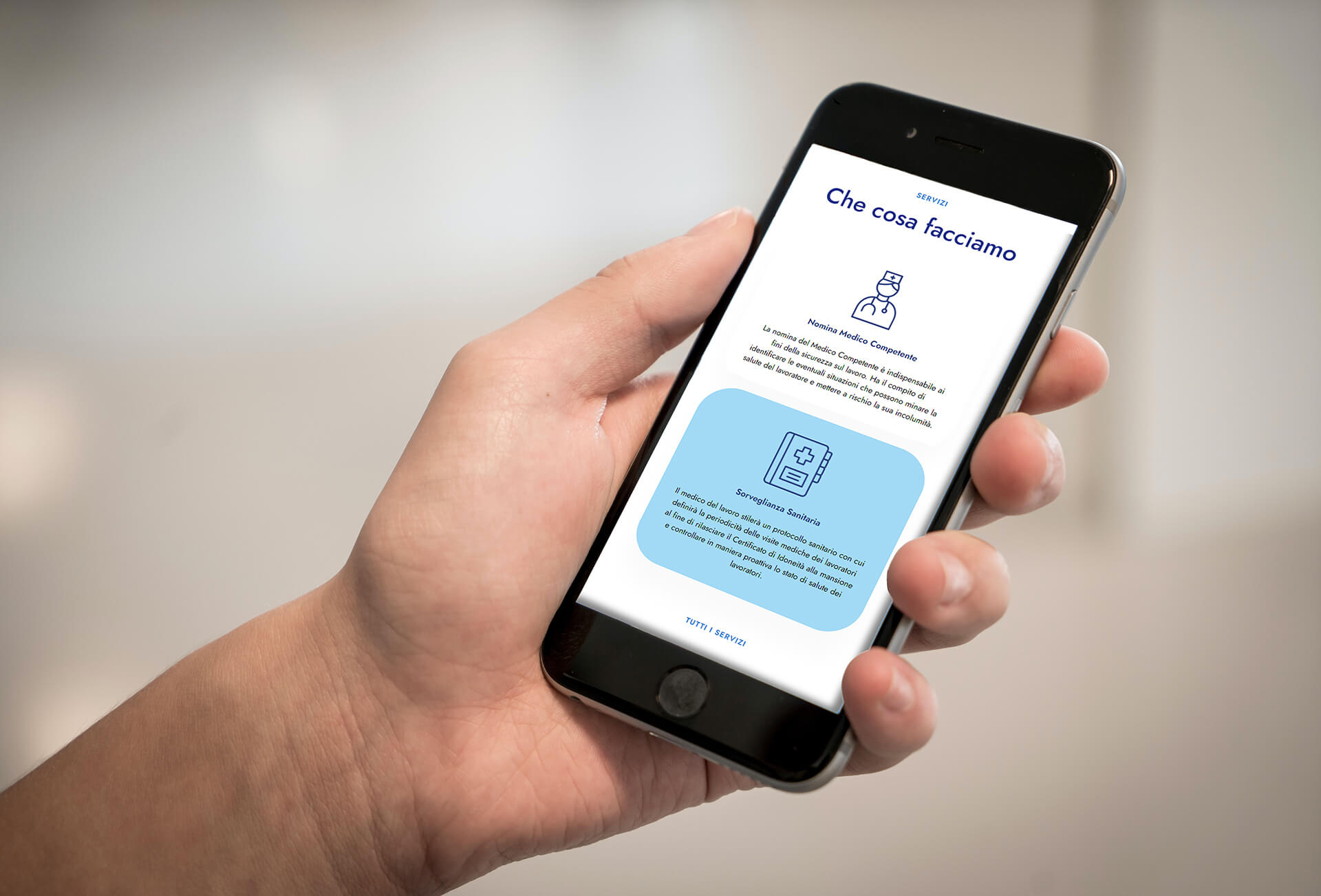
Landing page
The one-page site is developed to provide an overview of all the services offered by MedLav and inform the visitors about the different MedLav centers in the whole Italian territory. The website follows the guidelines defined by the brand identity strongly recalling logo colors and graphic lines.